How to Read an Image Histogram
Histograms in Photography
The selection of the camera settings for your wildlife photography, will have direct bearing and influence on your images histogram. How to read your camera’s image histogram? This is something I often get asked about by many people. What is that graph that’s showing on the camera? Of course, they are talking about the ‘image histogram’. Explaining concepts like the ‘How to read an image histogram’ is one of the tougher parts of teaching photography. Carry on reading if you want to learn about the ‘how to read a histogram’ in Adobe Lightroom CC and photography generally.
Understanding Histograms
I know this little graph sometimes keeps appearing on your camera and is sitting quietly in the corner of your Lightroom CC workspace. You will see the image histogram appears in the ‘develop’ module and the ‘library’ modules of Lightroom CC.
Some of you might already be familiar with the ‘histogram’ but would like to learn more about it. I personally refer to the histogram a lot when, a) I am actually taking a photograph and b) when I am developing a photo in Lightroom CC; so I want to make sure you all have a good understanding of how to use it and interpret the histogram.
Histogram Definition
To understand what a histogram is let’s first look at its definition. A histogram represents a graph of the pixels in a photo, based on how bright or how dark the pixels are. If we look at a formal definition of a histogram let’s say in Webster’s, you would read “a representation of a frequency distribution by means of rectangles whose widths represent class intervals and whose areas are proportional to the corresponding frequencies.“
Say What….
That definition couldn’t be more obscure and technical-sounding could it? To put it in simple terms, a histogram is a visual representation of an image’s luminance (Brightness) content, shown as graphical data, based on how bright or how dark the pixels are.
Pixels
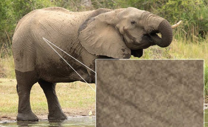
If you’re not sure what ‘pixels’ are, I’m going to zoom in here on this elephant photo all the way to 11:1 so that you can see the individual squares in the photo. Those are the individual pixels, so, in this instance, the ‘lightroom histogram’ graph has counted the number of pixels based on how bright and how dark they are in the image and represents them as a graph a ‘histogram’.
How to Interpret an Image Histogram
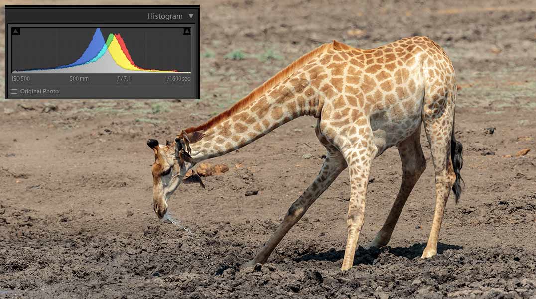
A histogram graph runs from pure black on the left-hand side (see below image) which in photography terms means completely underexposed, or black with no detail, to pure white on the right-hand side which in photography terms means completely overexposed or pure white with no detail.
In technical speak it means the luminance (brightness) range of such data (blacks, whites and mid-tones) lies in its placement on the ‘histogram’ graph, from left to right, and on its X-axis (Up/Down). The left end of the histogram represents darker (shadow) data, and the right end represents the brighter (highlight) data. Naturally, the middle of the graph displays mid-tones. The amount of any specific luminance value is represented by the Y-axis (up and down).
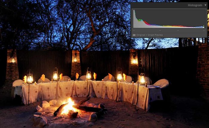
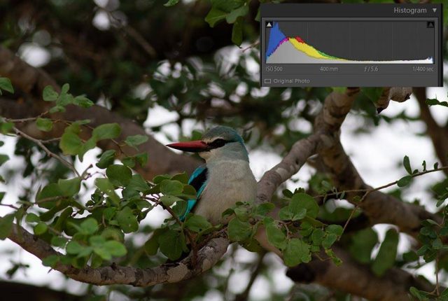
To make the above description more understandable, let’s begin with the below example. If you create a photo that’s ‘technically’ underexposed, the histogram might appear this way.
Histograms for Effect
If you were to look at the above image’s histogram on its own, you might think the image it represents is underexposed and lacking overall data. Actually, there’s nothing technically wrong with it. Photographic art is not always accurately represented by technical data, and sometimes, technical rules are purposefully broken for dramatic effect.
What is Clipping in Photography
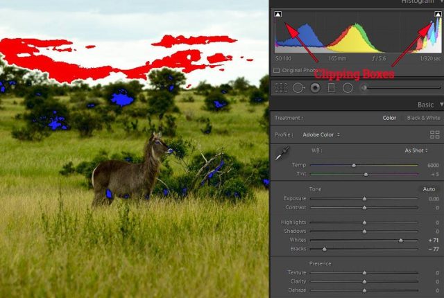
Clipping, when shown on the histogram is seen as data touching the very ends of either side of the X-axis: the left end (shadows) or right end (highlights). This indicates a loss of data on either end of the luminance (brightness) spectrum. Sometimes, clipping is less obvious, showing up as a thin sliver on the very end of a graph.
The good news is that with editing software like Lightroom CC, you can easily turn clipping indicators on. (See my blog post setting black and white points to learn how). By turning these ‘on’ and thus alerting you to any loss of data when post-editing, within a tonal range (see below image).
The bad news is that, as I mentioned above, you can’t recover this lost (no detail) data in post-editing, if its already lost in camera. However, there is a helpful tool for ‘in camera’ use and overexposure (brights) which is of great use to the photographer, at the time, when taking the shot.
Clipping in a Photo
The tool to which I refer is called the “highlight preview” and found in your camera’s playback menu, (different cameras will have different locations for this within the menus) these previews will ‘actively’ alert you (via blinking ‘highlight’ warnings) to any ‘highlight’ lost detail ‘clipping’ while you’re taking your shots. Alternatively, if you just hover over the shadow (left) indicator it will show you what, if any, ‘shadows’ are clipped i.e. which parts of the photo are pure black with no detail. You can alternatively hover over the right-hand side triangle, which shows you which parts of the photo again, if any, are pure white and blown out with no detail i.e. which highlights are clipped.
A Working Example of How to Read an Image Histogram
As you edit, particularly when you make your global exposure adjustments (exposure, highlights, shadows, etc.), you will notice your histogram changing. These changes can be seen in real-time in the upper right-hand corner of Lightroom’s develop module.
Under Exposed Image?
Notice how this image above appears rather dull and quite flat. Most of the data is centered around the ‘left’ side of the histogram, representing the shadows and dark areas. The clipping on the left means that we’ve lost ‘unrecoverable’ data/detail in the image’s deep shadows, this can be seen in the trees behind and below the bird.
Some of the shadow data that wasn’t lost (for example some of the less dark branches) can be recovered with post-processing software, i.e. Lightroom; but keep in mind you may bring digital noise out from the shadows when brightening the dark areas.
For this reason and many others, it’s crucial to shoot in RAW format where ever possible and not Jpegs, as the RAW format preserves the maximum amount of image data to work with.
Over Exposed Histogram
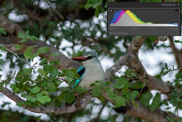
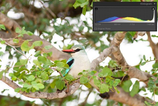
Notice how much of the data in the above overexposed version is allocated to the right (highlight) portion of the histogram. We also see some ‘clipping’ on the right end of the histogram graph, indicating blown-out data in the highlights. The highlight ‘clipping’ comes from the very bright sky highlights in the background and these cannot be recovered in post-processing as seen in all three images above.
Is Their an Ideal Histogram?
In writing this ‘How to read an image histogram’ I want to convey an important point. Photographers should know there is no “ideal” histogram for all situations, just remember editing your photos is an art, it’s not a science, there is no right answer or correct answer to editing. However, you ideally should have most data centred in the mid-tones and not too much in the shadows or highlights, maybe only slightly shifted to the right. So, a healthy histogram will show up as a strong graph which shouldn’t appear too ‘thin’ or lacking in data. The histogram should ideally be centred around the middle with no data running off either end of the graph. Then again, rules can and will often be broken.
Expose to the Right
I think it’s worth mentioning, at this point, that the optimal placement for the ‘brights’ data is as far to the right as possible without blowing out any significant highlights, or any highlights that you want to retain. This is called exposing to the right or ETTR. It’s in digital photography that we want to expose as brightly as possible without blowing out the highlights. I normally expose at around +1/3 stop in this regard as a general rule of thumb.
But unlike the earlier example of the underexposed ‘Boma Fire’, image you could have an image that is intentionally dark or “low key”. The histogram for this image might not look evenly distributed at all. A similarly uneven distribution could be produced by bright, “high key” images. Such image production reflects legitimate stylistic photographic interpretations.
Colour Histograms
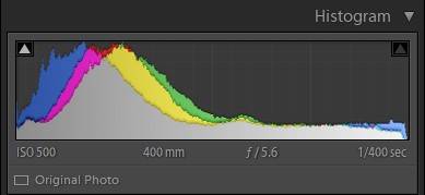
Colour histograms work similarly to an ‘exposure’ (standard) histogram, but they show you where the data is in each ‘colour’ channel of (R)ed, (G)reen, and (B)lue. For a properly colour-balanced photo, you’ll want a mostly consistent ‘peak’ in each colour channel as shown on the left (see histogram image on the right). Lightroom integrates the colour histogram in the same display as the exposure histogram (shown here in grey). All are shown together as one graph in the upper right corner of the ‘develop’ module. Of course, where you get RGB colour overlaps you will see magenta and yellow in the graph.
Photoshop Colour Curves Adjustment
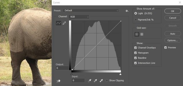
In Photoshop, however, each of the three RGB channels can be manipulated separately. To do this, use the keyboard shortcut Ctrl (PC) or Command (Mac) + M to bring up your curves adjustments, see below image.
Under “Channel” on the curves adjustments box, select any of the three colour channels from the drop-down menu to view each channel’s histogram, and then, manipulate each separate channel to achieve colour balance if one of the colour channels looks different from the rest, it’s possible you may need an adjustment.
Conclusion
I have shown in this ‘how to read an image histogram’ post that much can be done to bring back detail and boost colours in post-editing. Histograms can still be a valuable tool in identifying your exposure and even colour data. Histograms can also help you to detect data-clipping or peaking and provide an opportunity for the photographer to adjust settings accordingly and get it right ‘in-camera’ which is always a better solution before we bring our work into a post-editing suite like Lightroom CC.
Photographers who want to maximise tonal ranges would benefit from attending to your histograms, not always as I have shown above but at least when the occasion calls for it. When the tools are at hand utilise them, as mentioned the ‘highlight preview’ function on your camera and the other built-in Adobe features in Photoshop and Lightroom assist the photographer to make sure of maximising your images potential.
- African Wildlife Photography Tips - February 23, 2020
- Low Light Wildlife Photography - November 26, 2019
- Bonamanzi Game Reserve - November 21, 2019

